Film Production Logos

 The first thing that catches the viewer's eye in this logo is the large, slightly three dimensional, gold plated badge. The first component of the sheer size of the badge is important as it has the connotation that they are a large successful film company themselves which promotes quality from the outset. Secondly the three dimensional feature adds a depth of meaning about the work that company do, connoting that they will bring these films to life appearing as close to reality as possible, much like the logo is brought to life by this feature. The gold plated badge connotes wealth and luxury which is important because it once again suggest they are the best. Lastly the clouds in background show that they are in the sky and the phrase "the sky is the limit" is very relevant as it shows that the company are the top in the film business. The Warner Bros have produced some quality well known films such as the Harry Potters, The Batman films and The Matrix. These are very well respected films which shows how the films produced conform to what is portrayed by the logos.

 The MGM logo immediately catches the viewers attention because of the fierce looking animal that is the main feature of the logo. The lion comes with many positive connotations for the film company, the lion is the king of the jungle which portrays MGM as the king in the world of film productions; setting them apart from competition. The lion also has the connotations of strong leadership, loyalty and strength which are all very valuable values for a film production company to have. Further to this, classy golden tape and badge show the wealth and high standards of MGM as a company. Adding to the serif font portrays the traits of taking care for the finest details which is important for film companies. MGM have made some very popular recent films such as 21 Jump Street, The Girl With The Dragon Tattoo and The Hobbit's. This shows they are keeping involved with the latest competition and producing well made popular films.
 Pixar have chosen a very simplistic logic which has the connotations that they like to produce simple and films that are easy to understand. This very relevant for Pixar as their main target audience is children. The basic sans-serif font also has the connotation that Pixar like to get the job done without overcomplicating the process, which is a great value to have for a film company. The baby blue background also connotes the values of trust, intelligence and wisdom from the symbolism from the colour and this is very valuable for a company like Pixar. The logo also features a bedside lamp which has the links to dreams and bedtime which suggests they produce films that take the viewers to a place of dreams and of a different world. This is very much the case as Pixar have produced films like WALL-E, Toy Story, Finding Nemo and Monsters, Inc.
Warner Bros Pictures:
DreamWorks:
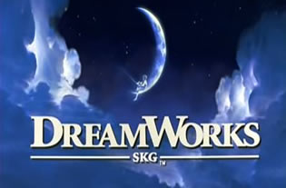
The DreamWorks logo suggests an element of mystery and fantasy from the aspects that are involved. Firstly the crescent moon and fluffy clouds portray the idea of another world and a place of dreams. This suggests that DreamWorks produce imaginative films that will take the viewer to a place of their dreams. The stars in the background are also important as it connotes the idea of fantasy because stars are often thought of as magical. Furthermore also suggesting that the company uses lots of top film 'stars' which shows they are of high quality. The little boy that sits on the moon links the idea of dreams with children's extraordinary imaginations and daydreaming, creating another mystical convention. This is supported by the films that DreamWorks have produced such as Kung-fu Panda, Shrek, Chicken Run and Madagascar. These are all family favourites because of their appeal towards children which shows the relevance of the logo conventions.
Metro Goldwyn Mayer:
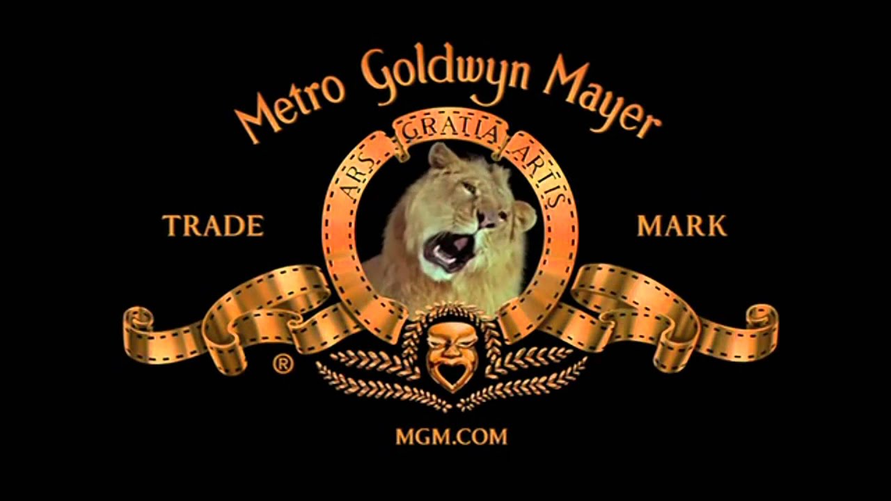 The MGM logo immediately catches the viewers attention because of the fierce looking animal that is the main feature of the logo. The lion comes with many positive connotations for the film company, the lion is the king of the jungle which portrays MGM as the king in the world of film productions; setting them apart from competition. The lion also has the connotations of strong leadership, loyalty and strength which are all very valuable values for a film production company to have. Further to this, classy golden tape and badge show the wealth and high standards of MGM as a company. Adding to the serif font portrays the traits of taking care for the finest details which is important for film companies. MGM have made some very popular recent films such as 21 Jump Street, The Girl With The Dragon Tattoo and The Hobbit's. This shows they are keeping involved with the latest competition and producing well made popular films.
Pixar:
 Pixar have chosen a very simplistic logic which has the connotations that they like to produce simple and films that are easy to understand. This very relevant for Pixar as their main target audience is children. The basic sans-serif font also has the connotation that Pixar like to get the job done without overcomplicating the process, which is a great value to have for a film company. The baby blue background also connotes the values of trust, intelligence and wisdom from the symbolism from the colour and this is very valuable for a company like Pixar. The logo also features a bedside lamp which has the links to dreams and bedtime which suggests they produce films that take the viewers to a place of dreams and of a different world. This is very much the case as Pixar have produced films like WALL-E, Toy Story, Finding Nemo and Monsters, Inc.
No comments:
Post a Comment